Personal Startup Project
ElderCare: An Aged-Care Support Concept
A mobile app concept for aged-care support — designed and prototyped end to end, but shelved when it couldn't secure the partnerships needed to launch
Year
2024
Role
Founder & Lead Developer
Duration
12 weeks
Read Time
6 min read
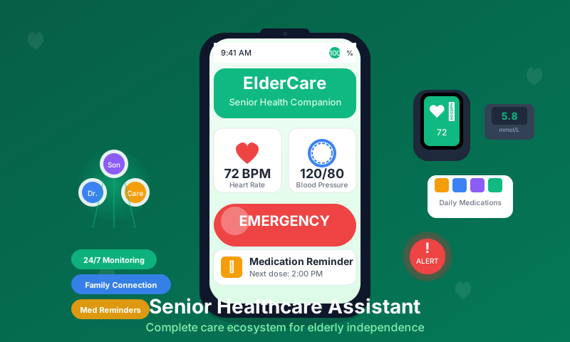
ElderCare: An Aged-Care Support Concept
ElderCare was a mobile app concept I designed and prototyped in 2024: a platform connecting families with aged-care support, wrapped around an elderly-facing app built to be genuinely usable by the people it was for. It didn't secure the partnerships and funding needed to launch, and I shelved it — but the design work and what I learned about the domain made it one of the most valuable projects I've done.
Being upfront about the status: this never went to market. There were no users, no caregivers on a marketplace, no clinical validation. What follows is what I actually built and designed, and what the project taught me.
The Idea
The premise came from a real gap. Families with elderly parents — especially families living apart from them — juggle care coordination through phone calls, paper notes, and worry. Meanwhile, most apps aimed at older users are just regular apps with a bigger font slapped on.
The concept had two sides:
- An elderly-facing app for the day-to-day: medications, appointments, one-tap contact with family, and a prominent emergency flow
- A family dashboard giving relatives visibility and peace of mind without turning care into surveillance
The longer-term vision was a marketplace layer connecting families to verified care providers on demand. That part never got past strategy documents — realistically, it needed partners in the care industry that I couldn't land as a solo founder.
What I Actually Built
Over roughly twelve weeks I took the concept through design and into a working React Native prototype of the core screens.
An Accessibility-First Design System
The most interesting design work was building UI components for users with reduced vision, motor precision, and technology confidence. This meant starting from different defaults than a normal design system:
// Design defaults for the elderly-facing app
const styles = StyleSheet.create({
  baseButton: {
    minHeight: 60,          // large touch targets, 80pt for critical actions
    borderRadius: 12,
    borderWidth: 3,         // visible borders, not just colour, to mark tap areas
  },
  buttonText: {
    fontSize: 22,           // body text starts where most apps' headings end
    fontWeight: '600',
  },
})
The rules I settled on: high-contrast colours well beyond WCAG minimums, navigation never more than a couple of levels deep, one primary action per screen, and an emergency button that is always reachable. Every component had proper accessibility roles and hints for screen readers.
The emergency variant of the design system got special treatment — always red, always oversized, always with a confirmation step generous enough that a shaky tap couldn't trigger it accidentally but a genuine emergency couldn't fumble it:
<SeniorFriendlyButton
  variant="emergency"
  size="extra-large"
  icon="phone"
  onPress={handleEmergencyCall}
>
  Emergency Call
</SeniorFriendlyButton>
The Prototype Screens
The prototype covered the elderly user's daily loop:
- Home dashboard — a single "how am I doing today" status view with large quick actions
- Medication reminders — scheduled notifications with big "Take Now" confirmations and a simple taken/not-taken log
- Appointments — upcoming visits in plain language, no calendar grid to wrestle with
- Emergency flow — a designed sequence for notifying family contacts with location, with escalation paths sketched for medical situations
On the family side, I prototyped a dashboard showing status at a glance, with the design principle that family visibility should be consent-based — the elderly user controls what's shared, with emergency situations as the only override.
Under the Hood
The prototype ran on React Native and TypeScript with Firebase handling auth and notifications, and a Node/PostgreSQL backend design for the data model — users, medications, schedules, family links, and emergency contacts. Stripe and the marketplace data model existed as architecture on paper for the never-built provider side.
The medication scheduling logic was representative of the level the prototype reached — real enough to demo, simple enough to rethink once actual care workflows were in the picture:
private calculateReminderTimes(medication: Medication): Date[] {
  const now = new Date()
  const times: Date[] = []

  switch (medication.frequency) {
    case 'once_daily':
      times.push(this.setTimeOnDate(now, medication.preferredTime))
      break
    case 'twice_daily':
      times.push(this.setTimeOnDate(now, '08:00'), this.setTimeOnDate(now, '20:00'))
      break
    case 'three_times_daily':
      times.push(
        this.setTimeOnDate(now, '08:00'),
        this.setTimeOnDate(now, '14:00'),
        this.setTimeOnDate(now, '20:00')
      )
      break
    case 'as_needed':
      break // no automatic reminders
  }

  return times.filter(time => time > now)
}
Each reminder notification carried "Mark as Taken", "Remind in 15 min", and "Skip this dose" actions, so responding never required opening the app and navigating — a small decision that came directly out of the accessibility-first thinking.
Why It Didn't Launch
The honest answer: aged care is a domain where a good app is nowhere near enough.
To launch responsibly, ElderCare needed things I couldn't will into existence solo — partnerships with care providers, guidance on healthcare regulation, real testing with elderly users and their families at meaningful scale, and funding to sustain all of that. I pitched the concept around and got polite interest but no committed partners. Without that support, launching would have meant putting a safety-adjacent product in front of vulnerable users without the validation it deserved. Shelving it was the right call.
What I Learned
Some products are partnership-first, not product-first. In consumer software you can ship and iterate. In aged care, trust and distribution come through institutions — providers, health networks, family word-of-mouth — and no amount of polish substitutes for them. I now evaluate ideas by asking who has to say yes before a single user does.
Designing for older users rewires how you design for everyone. Working through reduced vision, tremor, and low tech-confidence forced a clarity that improved my design work across the board. Big targets, one job per screen, and plain language aren't accessibility concessions; they're just good interfaces.
Autonomy is the design problem in family care tech. The tension between family peace of mind and elderly independence sits under every feature decision. My answer — consent-based sharing with an emergency override — came from thinking hard about dignity, and it's the part of the concept I'm most confident was right.
Knowing when to stop is a skill. I could have kept polishing the prototype indefinitely. Recognising that the blocker was structural, not technical, and shelving it cleanly meant the twelve weeks stayed a genuine learning investment instead of a slow-motion sunk cost.
Interested in similar results?
Let's discuss how I can help bring your project to life with the same attention to detail.